
Data Insights

Data insights will allow you to build dashboards dynamically. This is done by selecting a layer(s), joining them on a field, and then creating a plot showing one metric vs another metric.
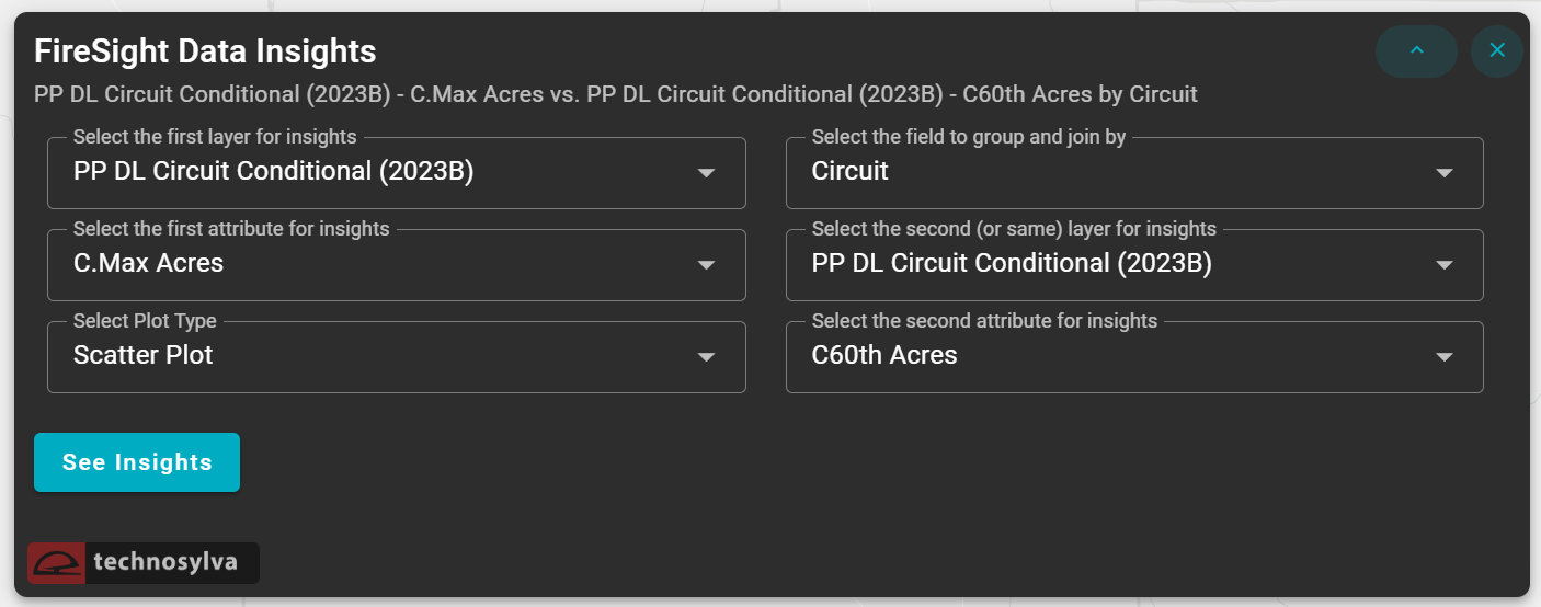
Fields
Fill out the fields in the pop-up window to create a data insight. You will select the first layer and attribute for insight. For the plot type, you will have the option of selecting between a scatter plot, table, bubble plot, and a heatmap plot. Then, select the field to group and join by. Lastly, you will select the second (or same) layer and attribute to complete the insight. Click ![]() when the fields are completed.
when the fields are completed.
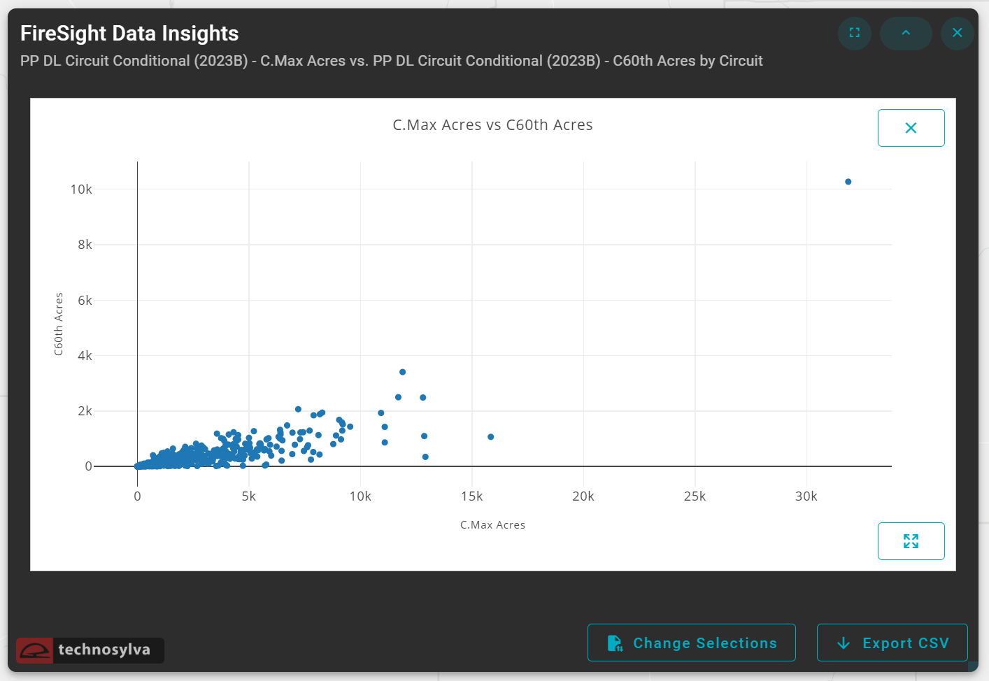
Dashboard
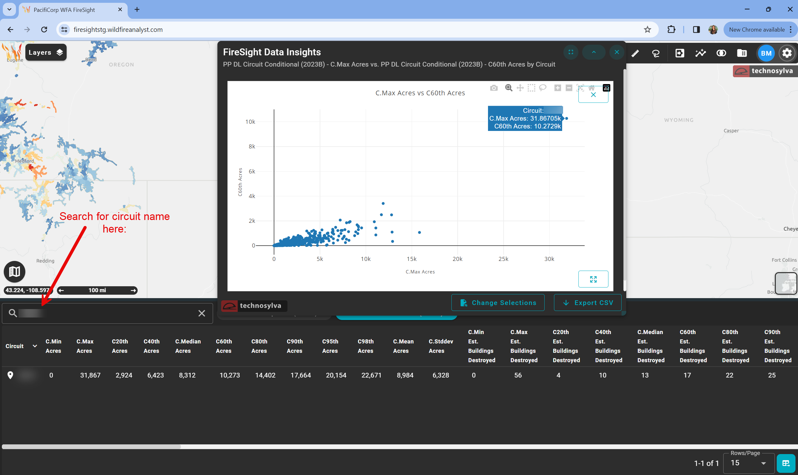
The application will produce a chart as you have selected in the fields. In this example, we selected a scatter plot.
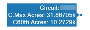
Hover over the data points on the chart to view more information about the data.
Note: you may view the corresponding circuit data by searching for the circuit name in the attribute table. The circuit name has been blurred for privacy reasons.
Dashboard Options
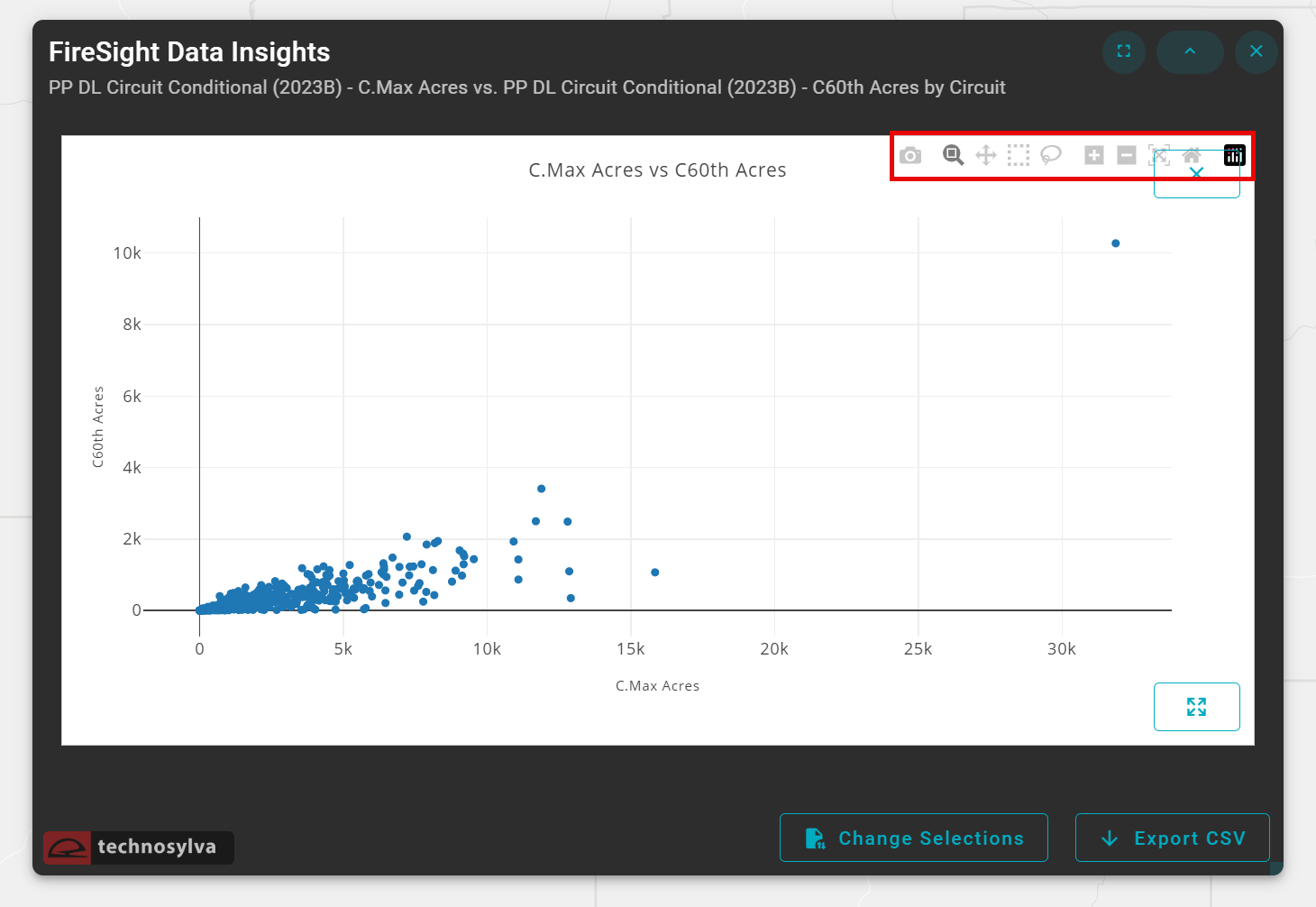
Hover your mouse on the chart to view additional options for your data. These options include:
![]() Download plot as a .png
Download plot as a .png
![]() Zoom
Zoom
![]() Pan
Pan
![]() Box select
Box select
![]() Lasso select
Lasso select
![]() Zoom in & zoom out
Zoom in & zoom out
![]() Autoscale
Autoscale
![]() Reset Axes
Reset Axes
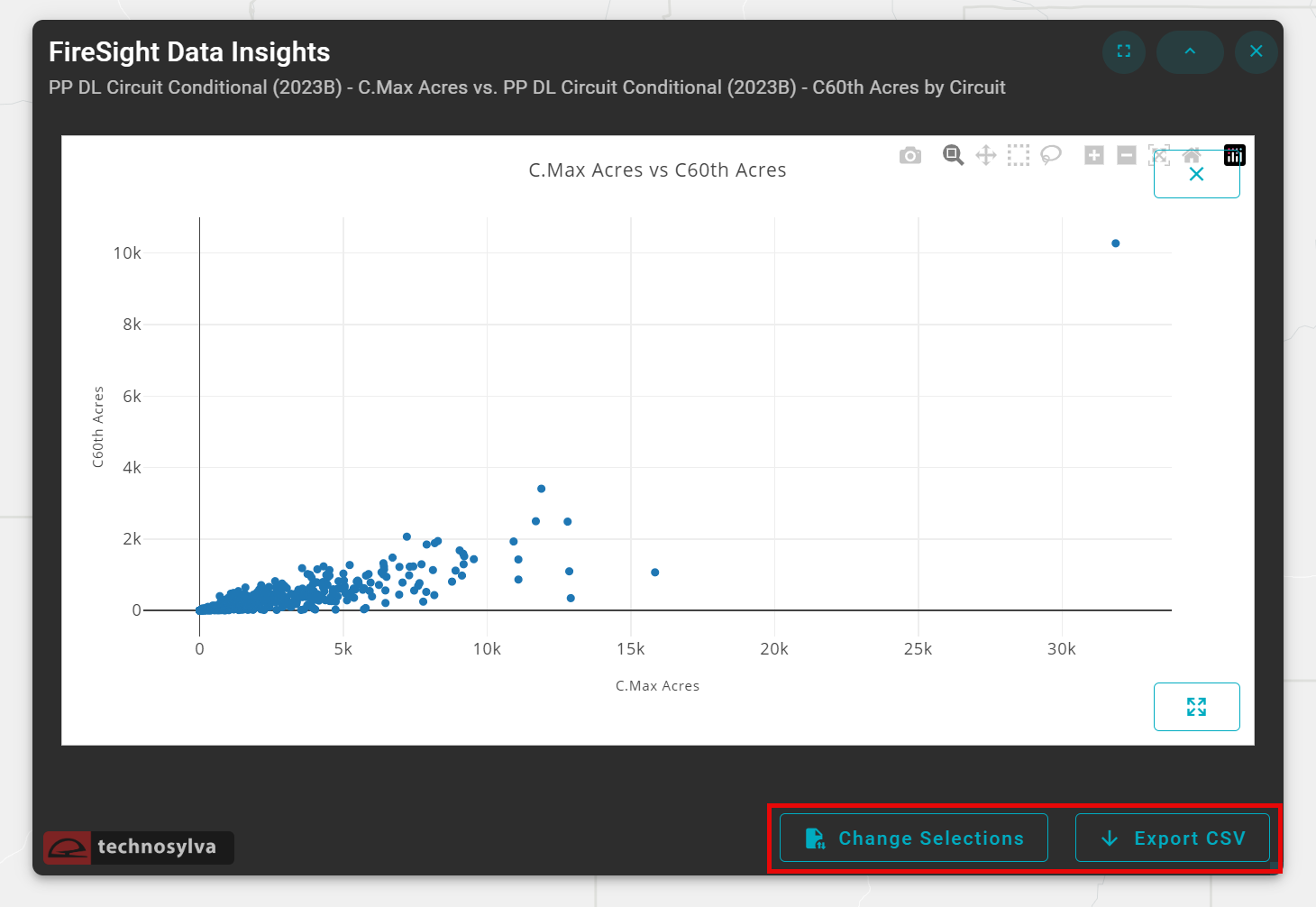
Use ![]() to quickly change your field selections. To export the chart as a CSV, click the
to quickly change your field selections. To export the chart as a CSV, click the ![]() button.
button.
Resize Dashboard
Tip: to resize the chart, use the diagonal arrow on the lower right hand corner of the dashboard window.