Daily Dashboards
The Dashboard tab on the left-hand side of the application offers a high-level daily wildfire risk by zone, transmission circuits, and distribution circuits.
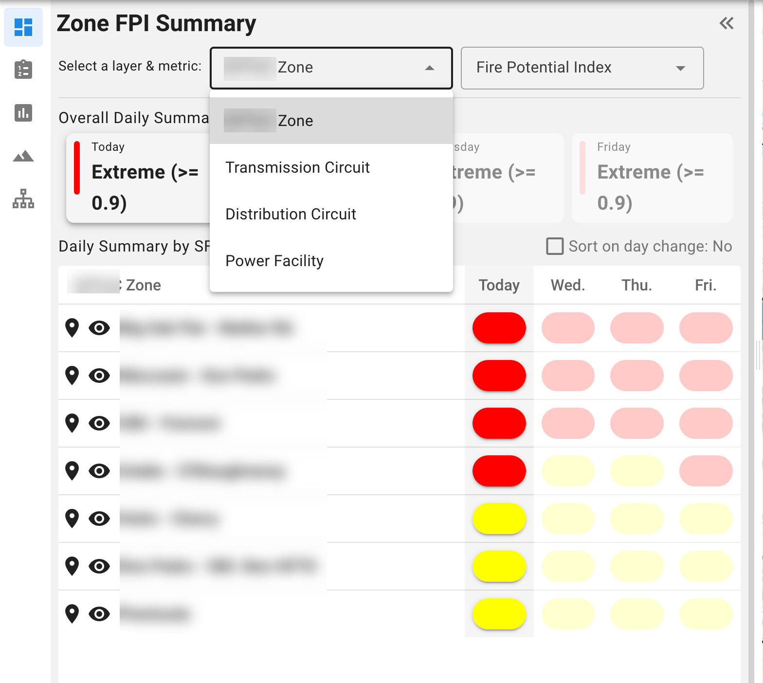
Daily Risk Metrics by Zone:
The new dashboard features Daily Risk Metrics by Zone for the 4-day forecast period. By default, the list will appear in order of descending risk for today. (The zone with today’s highest risk, whichever metric is selected, will appear at the top). All risk metrics calculated within the application are also applied to the zones in this dashboard, and these will reload in descending order depending on which metric is selected.
Open the Map Legend on the bottom left-hand corner of the map to decipher the colors; the colors used in the dashboard are the same as used for the risk layers on the map.
Tip: Hover over each colored oval to see a pop-up window with the value.
Additional functionality within the dashboard allows the user to:
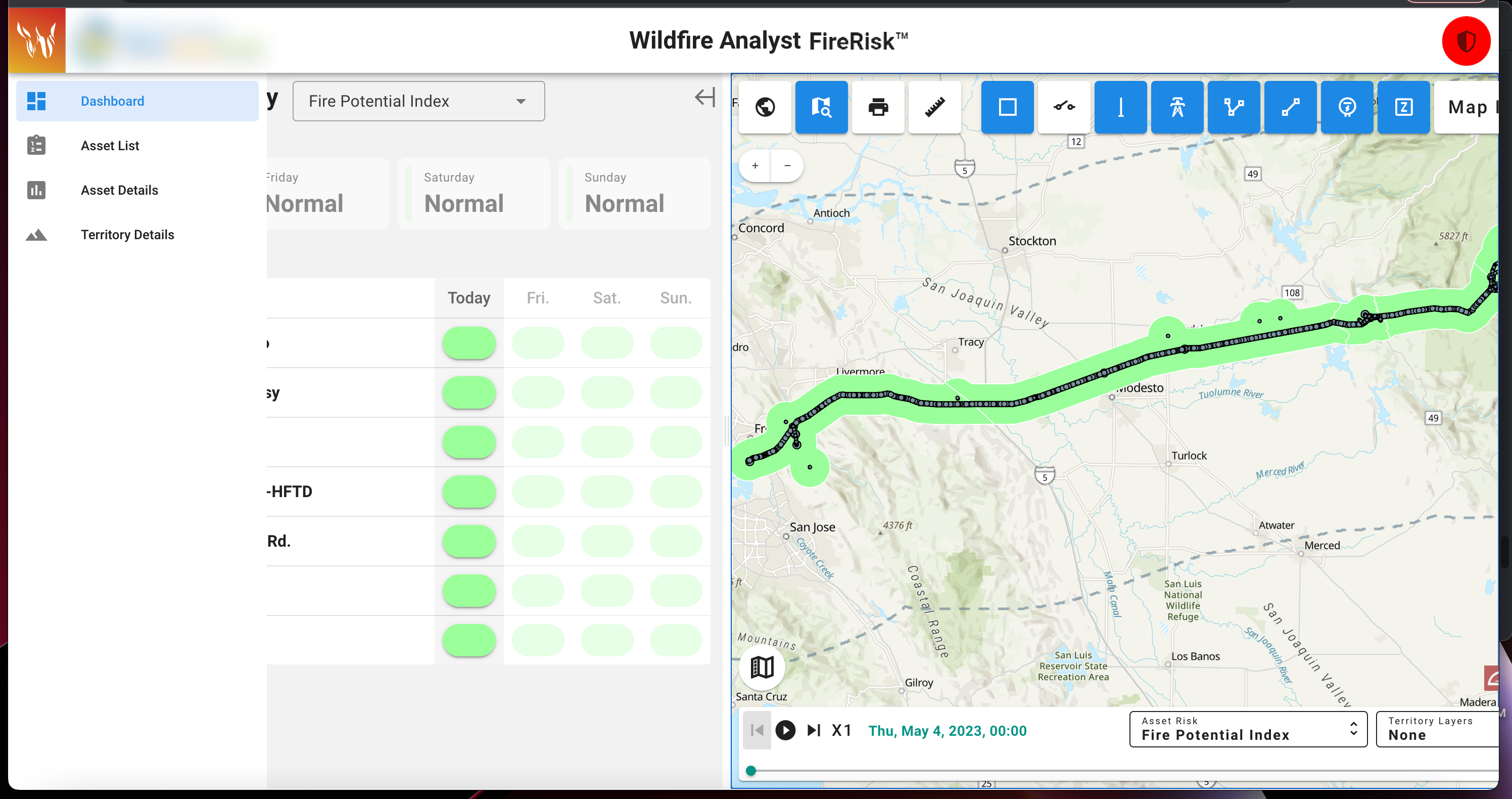
Click through to zoom into the asset on the map.
Toggle off the metric colors by minimizing the dashboard, if need to see the zone colors.
Through the user settings menu in the upper right-hand corner, the user can save the dashboard view as the default view when they load the app.
Zone Details
Users can also click on any zone from the map and click “view details” for that point in the zone to view the profiles for all risk, weather, and fuel metrics.
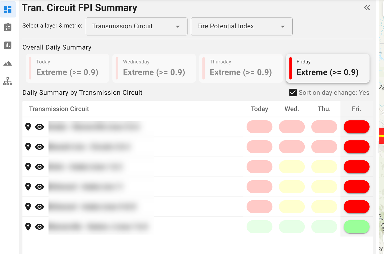
Daily Risk Metrics by Circuit:
At the top of the dashboard panel, use the dropdown list to switch between zone and circuit views to load daily risk by other assets. All the same functionality applies to the circuit dashboards: zoom to asset and view asset details.
Check the box to “Sort on day change”, to bring the zone or asset to the top of the list with the highest value metric selected.