Timeline

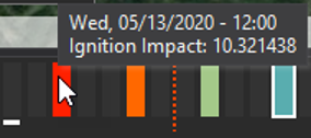
The Timeline appears at the bottom of the window. The timeline represents the 72 or more hours of weather for the currently loaded forecast. Vertical bars (called time slices) are presented for every hour of the forecast and provide a visual indicator for conditions at that hour. Weather data is available for each hour.
Wildfire risk forecasts are created every 3 hours and these are represented by colored bars. The risk forecast colors range from blue to red. New daily risk forecasts are available to download every day at 8 am.
Wildfire Risk forecasts are created every 3 hours, not every hour.
Risk Colors
The color range shown for the risk forecast hours reflects the percentiles for the risk metric for that hour during the forecast. This helps to show which hours in the forecast have the greatest potential for impacts from fires (i.e. worst risk). The metric used to create the percentiles is the average potential acres.
For example, red bars indicate the time when the average number of acres from fires is highest if they occur, across the entire forecast period and project area. It is important to note that other times may also have high risk in specific areas and these may not be reflected. The percentiles are created for the entire project area. Accordingly, when viewing other times that have a lower percentile (blue or green color) it is possible specific areas may have high risk.
Selecting a Specific Time
You can select a specific hour by clicking on the time slice. The example below shows this by a white outline around the hour selected. The date and hour selected is also shown in text at the left of the timeline (i.e. Wed, 05/13/2020 06:00). Time is displayed in 24-hour format (i.e. 11:00 PM is shown as 23:00). Your current time is indicated by a short horizontal white bar under one of the time slices. In this case, the white bar indicates that it is 10:00.

The timeline is used to select the forecast times for viewing FireRisk risk outputs or for starting a FireSim spread prediction.
Note: The timeline is displayed in current local time, and accounts for the time change for locations that observe daylight savings time.
Viewing FireSim start & End Times

When viewing a fire spread prediction created by the FireSim tool, thin dashed orange lines are displayed on the timeline to indicate the start and end time of the loaded simulation. This will aid you in reviewing the time slices of the simulation.
Select FireSim Start Time

The timeline can also be used to select the start time when creating a new simulation. Hover over a time slice to view the date/time it represents. Click the time slice to select simulation start time.
Timeline Controls

The timeline controls on the left side of the time can also be used to animate weather or risk forecast maps automatically (play button). Pressing the button again will stop the animation. A metric must be selected in either the Weather Forecast or Risk Forecast panel first.
In addition, you can manually view time maps by using the forward and backward arrow buttons.
